Let’s talk about making a good first impression
>> Part Three in the series The Top 5 Things You Need To Launch Your Website and Get Found Online (here’s the initial overview post in case you missed it).
We all know that first impressions count, and this is particularly true when it comes to your website! This is why it’s important to have a strategy around your branding.
What are some of the things that will help you make a good first impression when visitors land on your website?
In this post we will have a look at your layouts, colours, fonts and images, and how to keep it all consistent.
Balanced layout
You need to have a balance of text, images and whitespace. There’s nothing worse than arriving on a website with a huge wall of text; people just won’t read it. You don’t need to overload your page with images either – choose just a few that are relevant to the context of the information on the page.
And don’t be afraid to use plenty of whitespace; less clutter makes it easier to navigate and understand the information. Break up your content with headings, sub headings, short paragraphs, and bullet points.
Balanced colours
There are lots of ways to choose colour palettes and we’ll have a look at a couple of tools below. As a general rule, stick to just two or three main colours plus a contrasting ‘action’ colour to use for links and buttons.
The most important thing to remember when it comes to your text is to have a good contrast to make it easy to read – dark text on a light background or light text on a dark background.
Fabulous fonts
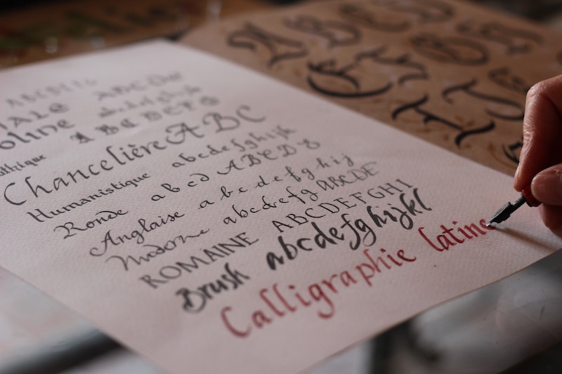
There are many typefaces to choose from for your website, both premium fonts as well as lots of free ones available from Google Fonts. We’ll have a look at Google Fonts below.
Use no more than two or three fonts – one for headings, one for body text, and perhaps a ‘fancy’ one (if you like) to use sparingly. You could use the same font for headings and body text but in different weights, but otherwise make sure they are not too similar. I often use a serif font for headings and a san-serif for body text, which gives a good contrast.

Picture perfect
It is essential to use good quality images and while there are lots of places you can obtain nice stock images from, you can’t go past having professional photos taken – they really make a difference in creating a great first impression!
A high quality logo is another essential, and I highly recommend using a professional graphic designer for this as they will create it in the correct size and format that is best for your website.
I’ll talk a bit more about finding and using images below.
Maintaining consistency
Consistency across your whole website, in your colours, fonts and overall style, will make a big difference in the impression that you portray. Too many colours and different fonts can be very jarring and look unprofessional.
So how can you keep this consistency?
Depending on your theme, you should be able to use the theme settings to set your default colours and fonts so that you don’t need to set them on each page. At a minimum, keep your colour hex codes handy so that you can copy/paste them when needed.
If you’re using Canva Pro, you will have access to a branding kit where you can save your logos, your colours and your fonts, making it very easy when you’re creating your images with Canva.
Your branding guide
In an ideal scenario you’ll work with a professional graphic designer and they’ll create a beautiful brand for you with the perfect colours and fonts along with your amazing logo and all the other brand elements you could think of. You’ll just follow the brand guidelines provided and away you go.
If you’re not quite at the stage where you are able to go this route, don’t worry; it IS possible to do it yourself and make a decent job of it.
Choosing your colours
There are a lot of tools available to help you when choosing your colours.
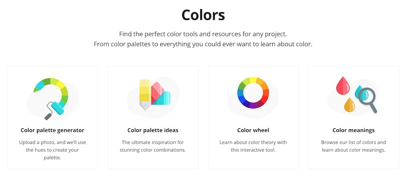
Canva has a few resources available, including a colour palette generator where you can upload an image and create a palette based on that image. Very cool! They also have ideas for inspiration, a colour wheel where you can choose complementary and other combinations. You can even learn about colour theory and meanings. https://www.canva.com/colors/
Another program is Coolors – https://coolors.co, where you can explore trending palettes and have some fun generating your own.

Choosing your fonts
Google Fonts has a huge range of free fonts. Just head to https://fonts.google.com/ and you can browse different types of fonts – serif, san-serif, display or handwriting fonts. Type in some text of your own to see how they look, and try them on in different sizes, and you can also see suggestions for pairings.
Google Fonts are easy to use and most WordPress themes will allow you to use them, but if yours doesn’t you can use a plugin that will allow you to use them – just search for Google Fonts in the repository.
You can also purchase fonts if you’re looking for something a bit different – have a look at https://creativemarket.com/fonts. Just be aware you need to purchase the webfont version, and do check the licensing details to make sure you comply.
Images
There are quite a few sites where you can get free images.
There are many reputable free sites that I often use such as https://unsplash.com, https://pixabay.com, and https://www.pexels.com. And of course, there are other sites that you can buy your images from which have better quality images, such as https://creativemarket.com/photos (I bought a nice pack from here at a very reasonable price) or https://www.shutterstock.com.
Never use images you find just via a search on the internet, or from someone else’s site. You must ensure you have the correct rights to use any images, otherwise you’re at risk of being caught violating copyright.
Need more help?
That wraps up all the deets on domains and hosting, but if you have more questions or need any help, you can get in touch with me either on my contact page or my Facebook page.
You can also view my video on this topic on my YouTube channel.
Next steps…
Watch out for part 4 where we’ll be looking at your website content, including
- what pages you need
- what to include on the all-important homepage
- how to engage your visitors
>> Have you joined my Website DIYers Hub yet?
This is a friendly place to interact and get support, feedback and encouragement, helping you to:
- Feel less stuck, more confident, and more in control
- Learn about ways to improve your website along with problem-solving tips and short tutorials
- Get online, get found, and get web savvy!
As a website coach for micro-business owners, I am here to help you with getting online and learning how to create, update and get better results from your WordPress website.
Hope to see you there soon!
Gaye
[et_bloom_inline optin_id=”optin_1″]


